I'm Alex Edwards, a Brand & Marketing Executive and Full-Stack Developer based in San Diego, California.
01 — Project Summary
Personal Safety Mobile App
02 — Project Details
Overview
When you find yourself in an unfamiliar, uncomfortable, or perhaps even dangerous situation — time is of the essence. In those scenarios, our phones become both our biggest ally and, in many cases, our biggest obstacle to assistance as well.
The sequence of events that must take place in those situations suddenly becomes arduous and daunting, even if you're lucky enough to still be in possession of your phone. You need to fumble around for the phone, unlock it with either facial recognition, pattern or code, select the appropriate app, choose the appropriate recipient, and then alert them to your danger by call or typing a text. A sequence like that requires focus in even the calmest of situations, nervermind in a situation where you're attempting to escape danger. Or worse - imagine you're trapped, and the person trapping you has gained possession of your phone. What do you do now?
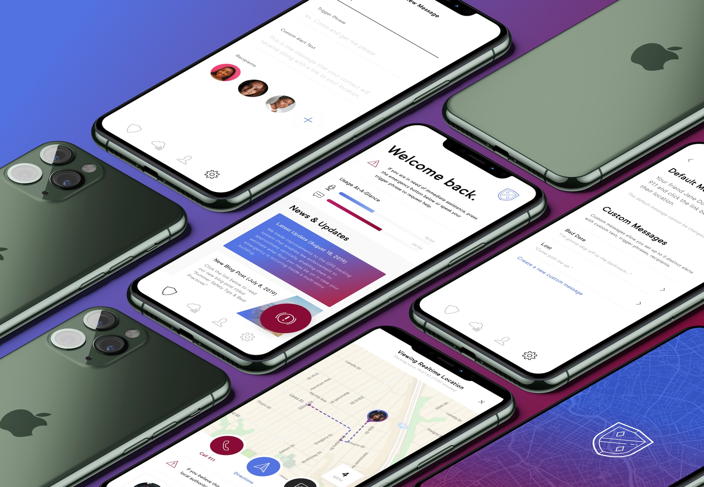
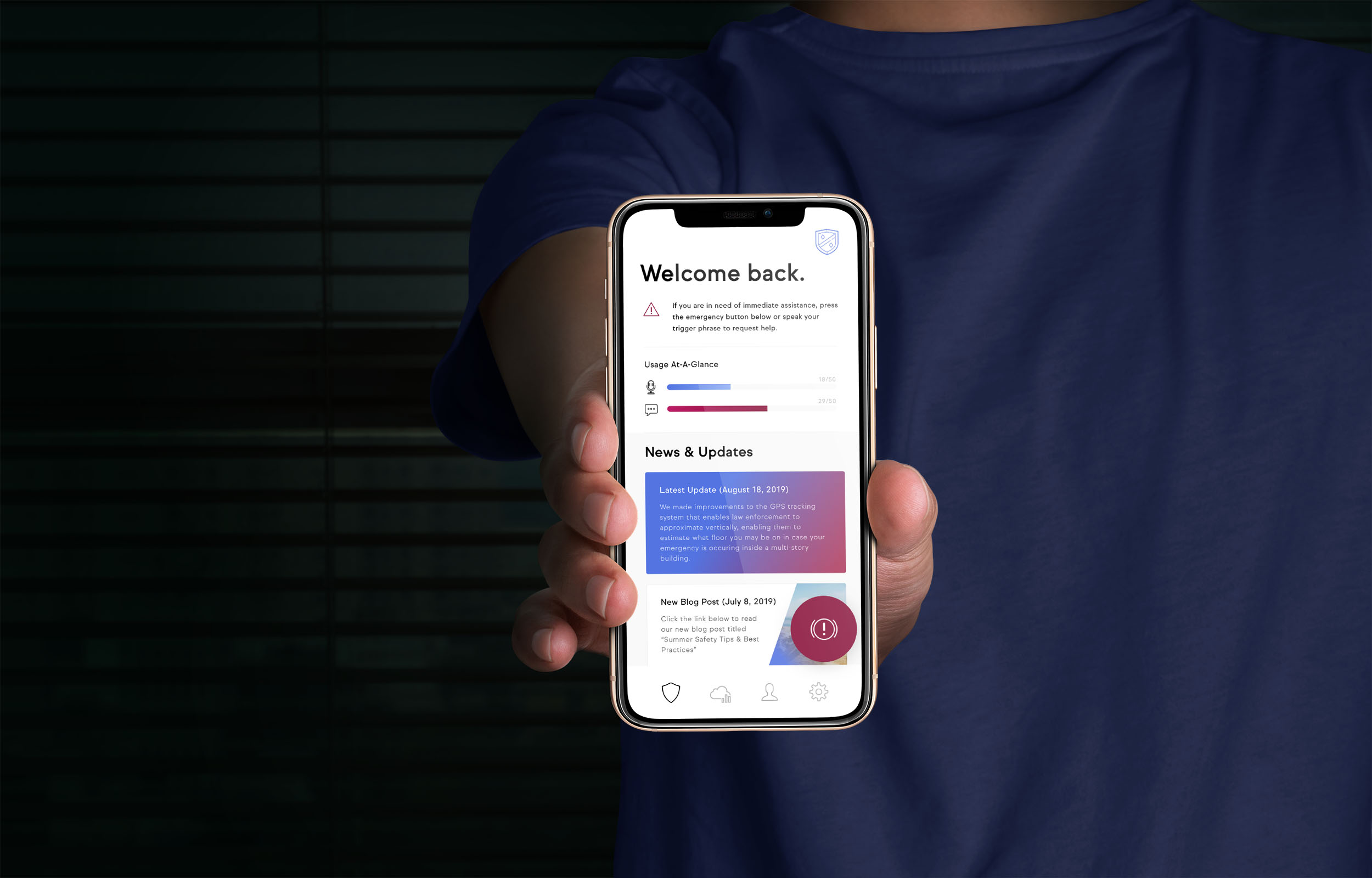
Personal Safety Mobile App(PSMA) is the first voice-activated safety app. Triggered by customizable phrases, PSMA immediately begins to record your surroundings, sends an emergency text message to designated contacts, and generates a link where those contacts can track your location in real-time. No matter the situation, help is always just a few words away.
Challenge
I was brought in by PSMA to lead the entirety of their visual identity — from initial stategic discussions surrounding brand positioning, through to the execution of the brand identity, app interface, and company website. For simplicity and clarity, this brief will focus on the mobile app, given its importance and the challenges it presented.
While PSMA was the first of its kind in regards to voice activation, we were entering a crowded competitive landscape populated by several established companies that had developed apps geared toward parenting and general family security. Each of these companies had several years of existence under their belt, and in many cases had amassed a sizeable customer base at the time we were developing PSMA.
The core functionality of our app itself created its own UX challenges. Manual trigger of the SOS, in the event the voice activation did not trigger properly, was an absolute necessity for the safety of our customers, and we needed to ensure the path to that action was as resistance-free as possible. GPS tracking screens needed to be clear and informative. Any time-added during any part of the user's activity flow could be the difference between safety and harm, which added increased urgency and weight to every UX decision we made.
Solution
Performing a brand-focused competitive analysis gave us a blueprint for how to execute the interface and overall experience of the PSMA app. The nature of our competitors' apps had forced them to shift most of their resources post-launch to customer support — a pivot which meant that aesthetics and usability were constantly being pushed to the backburner. Many had interfaces that looked dated, and key interactions based on usability conventions of years past. We saw this as a major opportunity during market entry, and the design and usability of the PSMA app became a cornerstone of our differentiation.
Colors, color gradients and brand design elements were subsequently chosen to enhance the feelings of trust and safety we sought for the app to create. We incorporated comprehensive white space to minimize clutter and distraction, and straightforward navigation supporting the core user behaviors. Contrast was used to draw attention to important information and actions.
Extensive usability testing guided us in establishing the structure of the interface to minimize resistance during the performance of key user actions. The aforementioned manual SOS button could be switched to the natural thumb hover position of either dominant hand. The GPS tracking screen was augmented with buttons which provided one-touch paths for emergency phone calling, generating directions to the user's location, or viewing vital medical information.
Each aspect of the design and experience of using the app was meticulously crafted with the safety and security of the end-user in mind.
Results
PSMA mobile app entered a public beta for approximately 3-4 months before it was acquired by and folded into a larger competitor. I assisted in executing the asset handoff and onboarding the new company's internal team to our efforts surrounding design and usability. The core features and functionality have since been rolled into the competitor's platform.
Personal Safety Mobile App
Responsibilities
Creative Direction, Branding & Visual Identity, User Interface Design, User Experience Design
Stack
Sketch, Illustrator, Photoshop, React Native
- HTML
- CSS/LESS/SCSS
- Javascript
- jQuery
- React
- PHP
- Headless CMS
- React Native
- Gatsby
- NEXTjs
- Greensock.js
- ScrollMagic
- d3.js
- Wordpress
- Git
- Shopify
- CodeIgniter
- Laravel
- MongoDB
- Adobe Photoshop
- Adobe Illustrator
- Adobe InDesign
- Adobe XD
- Adobe Lightroom
- Adobe Premiere
- Adobe Premiere Rush
- Sketch
- Figma
- Creative Direction
- Graphic Design
- Responsive Web Design
- User Interface Design
- User Experience Design
- Print Media Design
- Presentation Design
- Content Strategy
- SEO
- Design Systems
- Design Leadership
- Identity Systems
- Copywriting
- Front-End Development
- Back-End Development
- Branding & Identity
- Strategic Planning
- Business Process
- Business Model Design
- Marketing Strategy
- Content Development
- Campaign Ideation
- Leadership
- Competitive Analysis
- Market Research
- English (Native)
- Portuguese (Professional)
- Spanish (Intermediate)
- Italian (Elementary)
01 — Project Summary
Furnace.io
02 — Project Details
Challenge
Turning vast amounts of technical information and complex behaviors into an interface that is not only intuitive, but actually enjoyable to use, is the endless struggle of those of us tasked with developing these kinds of interfaces and experiences. Furnace has those challenges in spades.
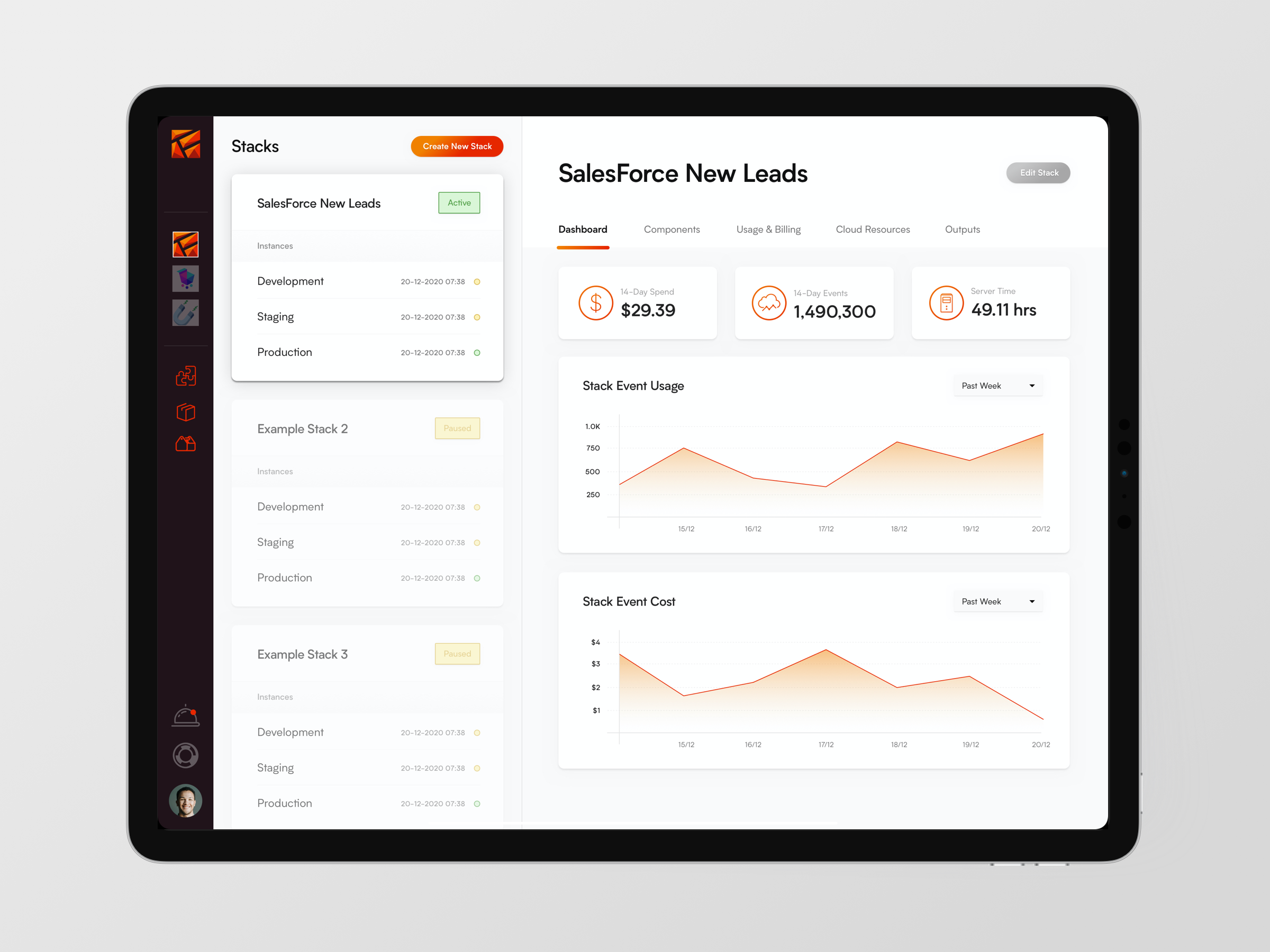
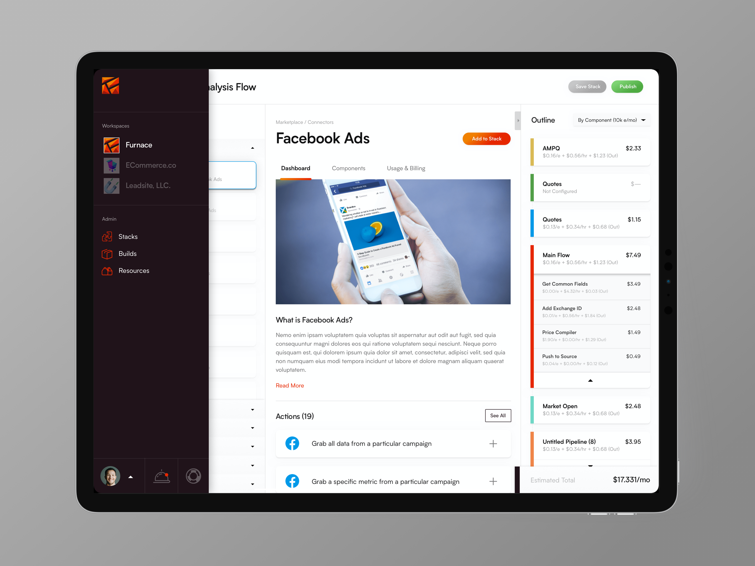
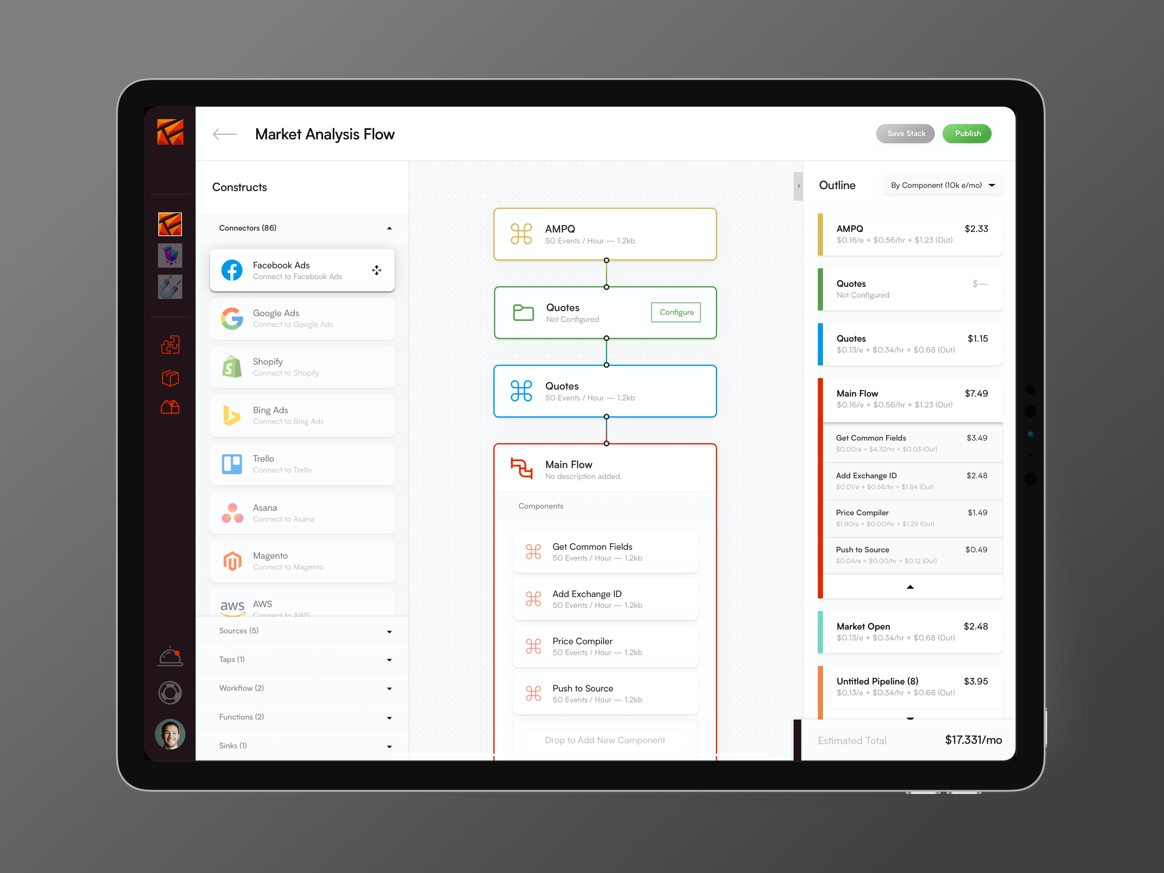
Furnace is a flexible streaming data pipeline solution that allows you to spend less time designing and managing infrastructure, leaving you more time to focus on doing great things with your data. It is a platform agnostic, serverless solution that allows you to build and manage your pipeline visually using building blocks, called constructs, that perform the pipeline's key functions. Once set up, you can track and monitor the status, performance, and manage billing for your pipelines through the interface as well.
The variety and vast amount of information needing to be consumed via the different behaviors possible through the platform, along with the concurrent need to provide a modern interface consistent with the Furnace brand, made each interface and UX decision that much more important as we progressed through the design stage of realizing the platform.
Solution
A heavy focus was placed on keeping the interface modular for clarity and digestibility. The foundations of the interface revolve largely around hierarchial 'card' and 'drawer' UI elements.
White and gray space was used generously to ensure that the interface never felt overwhelming or cluttered, even in the presence of a abundance of technical information and actions available to the user.
A rounded geometric sans-serif font was used throughout the interface to keep it approachable. It is the only typeface used throughout the project, to further reduce the amount of visual distraction to the user.
A minimal brand color palette was used for the core aspects of the interface. In places where a significant amount of options or information presents itself, we leveraged vivid primary colors to aid the user in making distinctions between the various sections.
The user can build their pipeline using a friendly, drag-and-drop experience. This further augments the 'human touch' of the app and allows the user to bargain with the interface in a more engaging and focused way.
Results
Furnace currently exists as a command-line interface, built on Node. The Furnace platform is expected to launch in 2021.
Furnace.io
Responsibilities
Branding & Visual Identity, User Interface Design, User Experience Design
Stack
Sketch, Figma
Creative Director & CTO
Currently leading branding, marketing, and visual collteral efforts, as well as spearheading development of the tech platform for a hard mony real estate startup
Refined and redeveloped the company brand, including the launch of a new company website
Developed the company tech platform and API via a pure Javascript stack (Next.js/React/Node) & MongoDB
Ideated and executed initial marketing, lead nurturing, and customer experience efforts to gain brand equity and establish best practice systems
Director of Design & Development
Led all visual design and development efforts for the small-to-mid sized branding and creative agency.
Modernized service delivery across all company services, implementing new technologies, best practices, and strategic initiatives which increased revenue year-over-year, including the largest single-year growth in the midst of a global pandemic.
Flexibly scaled team capabilities through management of internal resources and a network of vetted outsource partners.
Freelance Creative Director & Full-Stack Developer
Belo Horizonte, Minas Gerais, Brazil
San Diego, California
Full-service creative consultant providing a wide range of digital services to small, medium, and large business clients.
Planned, designed, and launched 30+ websites, countless marketing campaigns and print media collateral pieces, brand identities, and more.
Excelled in both team member and team leadership capacities, executing both full-stack independently and in specialized, single-discipline roles.
Provided strategic and visual support on investor presentations leading to the acquisition of over $25MM across several funding rounds.
01 — Project Summary
Arise Design + Brand: Web Projects
02 — Project Details
Company Overview
Arise Design + Brand is a small-to-mid sized branding and digital agency dedicated to creating positive impact in the world through branding and design. We seek to work exclusively with purpose-driven companies who share a similar mindset surrounding making a net-positive impact on the world. I joined Arise Design + Brand as Director of Design & Development in 2018. In the years since, I have spearheaded transformative growth across all facets of the organization - helping it to not only survive, but thrive through the COVID-19 pandemic, and positioning it to be a force in Southern California for years to come.
Growth Catalyst
Key highlights from my time at Arise:
- Increase in company capabilities and strategic expertise led to an increase in average total contract value by 100% year-over-year.
- Increase in company revenue year-over-year, including during the COVID-19 pandemic.
- Led the agency rebranding effort and re-designed the agency website.
- Executed more than 30 web projects for a variety of clients across a variety of industries.
- Expanded the company network of strategic partnerships and freelance talent.
- Positioned the company for the future success by introducing and incorporating modern technologies into its project stack.
Projects
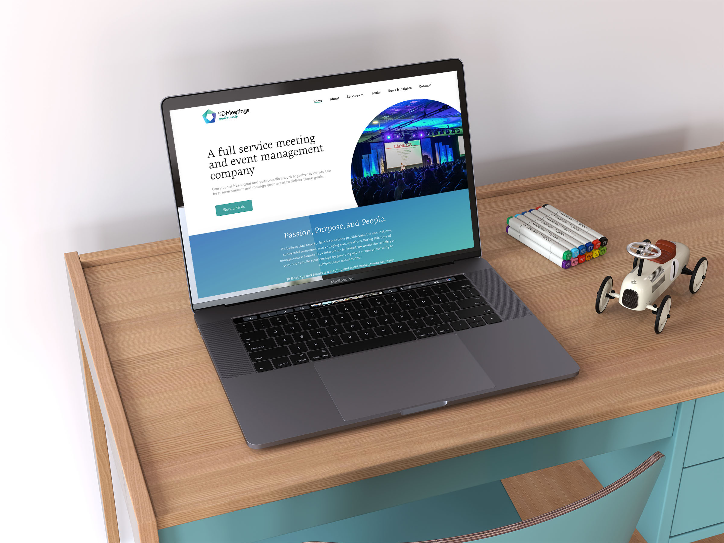
The images in this brief represent a selection of web projects executed in my role at Arise Design + Brand. Code examples and links to specific projects can be made available upon request. URLs can be viewed by clicking the image and opening its lightbox view. The plurality of the projects shown were built using a SLIM Framework (PHP) or Gatsby (JS + GraphQL) back-end, fed by the Prismic headless CMS.
Arise Design + Brand: Web Projects
Responsibilities
Creative Direction, Branding & Visual Identity, Website Design, Responsive Design, Front-End Development, Back-End Development, Strategy, Presentation Design, Design Leadership
Stack
Sketch, Illustrator, Photoshop, HTML, CSS/SASS, Prismic, React, Gatsby, PHP, SLIM Framework, Wordpress, Webflow
Biography
I'm a musician and can play over 20 different instruments. I originally attended the Berklee College of Music, intending to study Film Scoring. While there, I once jammed with John Mayer.
To use my creative talent in order to create the maximum amount of positive change in the world that I can in the time I have.
Playing one of my instruments, in the gym or running through the city, sharing a laugh with friends, documenting the beauty of the world around me with my phone, or watching soccer.
Daniel Caesar, Warez, Bonobo, Tycho, Sylvan Esso, The Black Keys, Hopsin, Kanye West, BØRNS, Norah Jones, Jamie XX, SZA, H.E.R., Rodrigo Alarcon, MEMBA, Damien Rice, John Mayer, Josean Log